Create a room for beyond babyhood
Interior designer Nicole Rosenberg shares her advice on creating a room for baby and beyond.
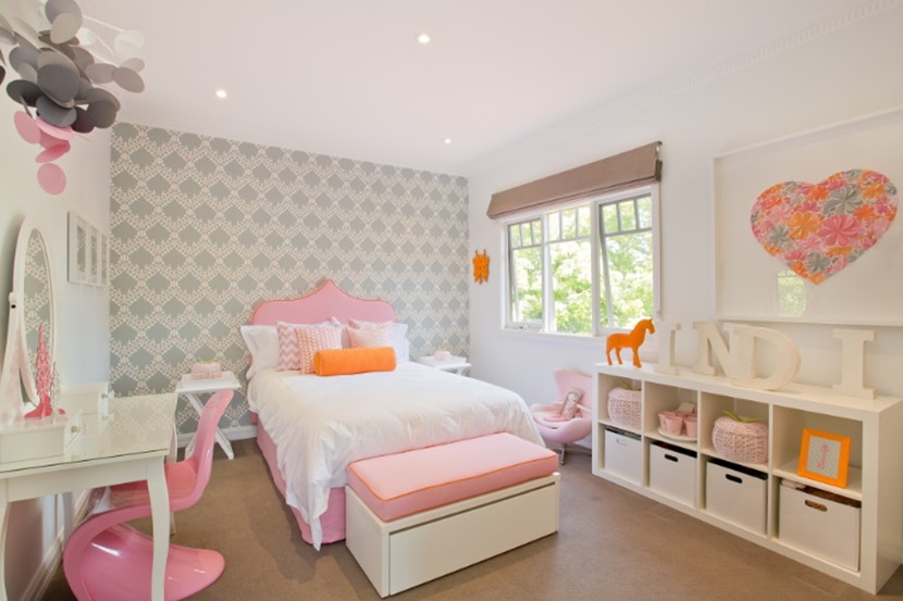
One of our favourite interior designers is Melbourne’s Nicole Rosenberg who specialises in creating gorgeous rooms for the littlest people in the house. A few years ago she designed a nursery for a very lucky baby girl. India’s parents have since had Nicole back to transform the nursery into a big girl’s room.
We asked Nicole about her vision for India’s room, and for advice on creating a room that grows with your child.
What was the client’s brief when you did the first design?
Nicole: My client had complete faith in me and let me run with whatever idea I came up with. I fell in love with the gorgeous Moroccan wallpaper from US designer Aimee Wilder and designed the room around that. I loved that the main colour was grey, so then played on the accent colours of pink and orange which are gorgeous colours for a girl of any age.
What changes have been made to transform it into a big girl’s room?
Nicole: The first thing I needed to organise was a big girl’s bed. I ordered a double ensemble and then got busy designing a bedhead to tie in with the wallpaper. I love how the bedhead turned out. The pink was perfect and really pops against the wallpaper and I also love the delicate orange piping. Every princess needs a vanity so I purchased one from IKEA, which is a great buy for any girl’s room. I also purchased two new bedside tables and a gorgeous custom-made art print from Mondocherry in Melbourne.
What do you suggest parents consider when designing a child’s room so that it will have longevity?
Nicole: I think colour is important. Avoid going too babyish with the colour palette, and instead use colours that can grow with your child. I always like to use a little grey as I think that can go from when you are a baby to an adult. Also, in terms of art or prints, you should think about getting as much longevity out of those pieces as possible. Vintage art prints are a great example as they’ve already had a long life.
Pink and orange together isn’t a common choice, but it’s modern and fresh. Why do you think it works?
Nicole: I love this combination – it’s one of my favourites for girls. I think the soft palette of the pink and the pop of the orange is a perfect match. Orange can be a little over-powering so I’ve only used it sparingly in the room and given more attention to the pink which is more calming. It’s great to use a softer colour and a more powerful colour together to give the room some spunk and personality.
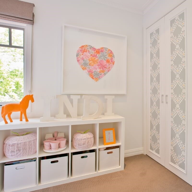
You’ve used the wallpaper on the wall as well as the wardrobe doors. What other, less obvious places can people look at for using wallpaper?
Nicole: The ceiling is a fantastic option for wallpaper. You can also use wallpaper on the front of a chest of drawers. These days we have some fantastic removable wallpaper options so wallpaper doesn’t have to be such a big decision. You can have it on the wall for five years and then change it.
What is your favourite piece in the room?
Nicole: My favourite piece in the room would have to be the stunning wallpaper with the gorgeous heart art piece coming a close second.
What is India’s favourite?
Nicole: Her big girl’s bed for sure! She was so happy to jump into it the first night she got it – what girl wouldn’t?


Photography: Gillian Perry, gillianperryfoto.com

AS FEATURED IN ISSUE 27 OF OHbaby! MAGAZINE. CHECK OUT OTHER ARTICLES IN THIS ISSUE BELOW
Your Pregnancy WOF Check
- Pregnancy and birth really put your body...
5 pregnancy sleep issues and how to treat them
- Whether you have a full bladder, leg cramps...
Eight essential nutrients for a healthy pregnancy
- Nutritionist Anna Hansen explains why eight...
Baby Loss - How To Help
- Baby Loss Awareness Week takes place every...
The wonder of slumber: settling techniques and sleeping tips for baby
- The topic of infant sleep tends to be rather...
Five tips for tired parents
- 1. Be kind to yourself. Remember that sleep...
Allergies: Symptoms Testing & Treatment
- A recent study revealed one in ten Kiwi...
Dealing With Bad Dreams & The Boogie Man
- For some kids, going to bed is a scary...
Are you Happily Incompatible?
- Opposites attract and then prove very...
How to adapt to your new role as a parent
- Becoming a parent involves significant role...
Get Fit Busy Mama
- From creature of comfort to recreational...
3 simple projects for sweet dreams
- Brighten up bedtime with these delightful...
Recycled Vintage Printer's Tray
- A vintage printers’ tray makes a great...
The Future of Infertility
- A lot has happened in the world of fertility...

