Black and white delight: a stunning kids bedroom
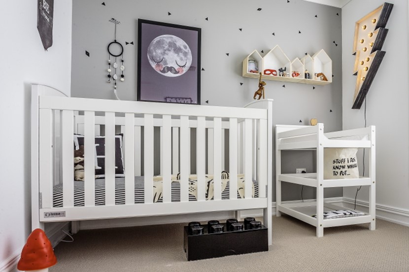
Take a monochrome palette and inject it with a bolt of design inspiration.
Kate Sparks is an Australian mum of two who received such praise and encouragement from friends and family after decorating her own kids’ rooms, that she launched her own interior design business (littledwellings.com.au) specialising in rooms for the littlest members of the house. We asked Kate for a tour of her son Harry’s super cool room.
What were you trying to achieve with Harry’s room?
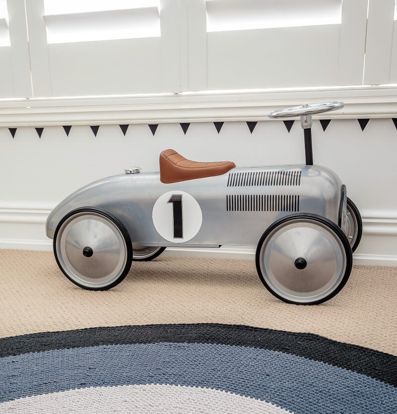
Kate: I knew I wanted to go with the black and white theme, but with a splash of colour – something fun that he’ll grow into. The best thing about the room is that when you strip it back, the white walls and grey feature wall offer a fresh clean palette, so as Harry gets older I can take out the bigger items like the cot and change table and put in a big boy’s bed. I can also add in some smaller, colourful items if I want to.
What storage solutions did you use?
Kate: Besides a built-in cupboard, the storage solutions around the room vary from felt baskets, to LEGO storage blocks. The storage baskets are a versatile way of styling a child’s room while making packing up easy and fun.
There are lots of shelves for displaying nick-nacks and little toys. How important is that in a child’s room?
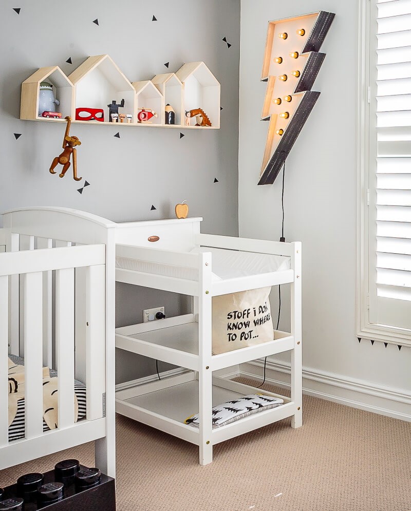
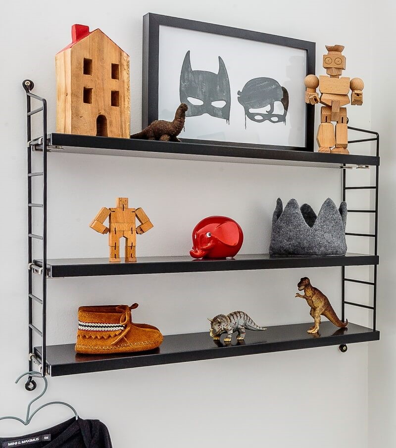
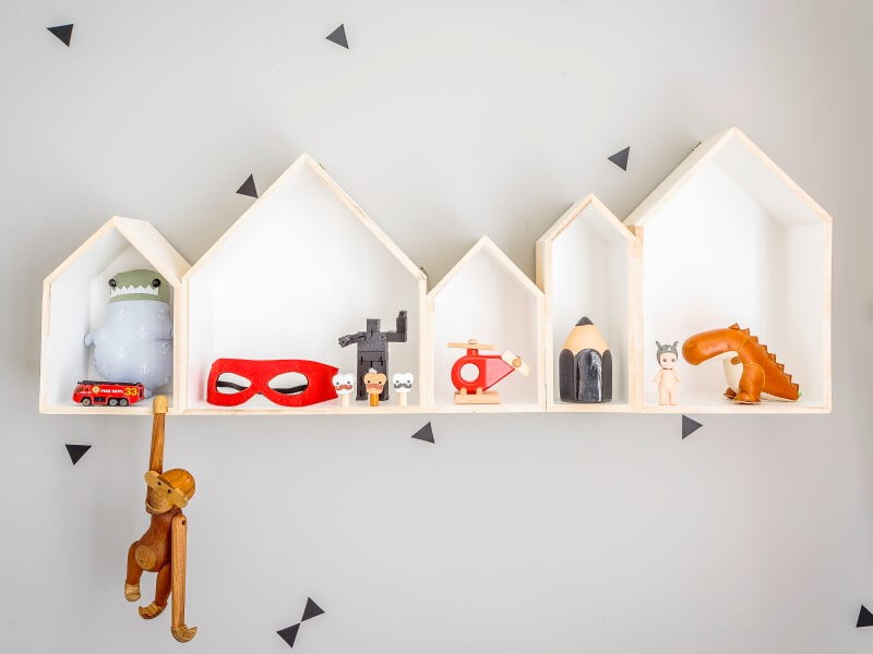
Kate: I believe shelving is important for any child because as they grow they can take pride in displaying items that they have either chosen themselves or, more importantly, their own creations made from LEGO or at school. In that way shelving becomes an ever-changing piece of art!

What’s your favourite thing in the room?
Kate: The lightening bolt (fromagelarue.com.au) is definitely my favourite. It is quite bright, so I haven’t used it as a night-light for feeding, however Harry has no problem falling asleep with it on.
Any advice for using wall decals?
Kate: The feature wall is a grey painted wall with lots of mini triangle wall decals. The grey was actually a late edition to the room as I felt it needed some warmth. The decals are placed randomly on the wall. With wall decals it’s really personal preference as to whether you want a random or uniform look. All I can say is that if you do randomise your decals make sure you don’t over do it, or at least have some form of pattern that you want to stick to. If you are going after a uniform look I suggest you get someone who is handy to put them on as they need to be equally spaced and level. This is not too difficult to do, (my hubby did ours) however it can be time consuming.
What advice have you got for others trying to replicate this look?
Kate: Irrespective of whether it is this look or another you are going for, I suggest that you only introduce items that will compliment the overall style you are trying to achieve. For black and white with a pop of colour, it is important that your palette is not too heavy and remember that you can always achieve your theme with accessories rather than big ticket items. For example all the black items in Harry’s room can be removed, but collectively they add to the look.



AS FEATURED IN ISSUE 28 OF OHbaby! MAGAZINE. CHECK OUT OTHER ARTICLES IN THIS ISSUE BELOW
Busting baby making myths
- If your man is smoke-free, eats only organic...
The noble placenta
- While admittedly not easy on the eye, the...
Top 20 sleep questions answered
- OHbaby! expert Dorothy Waide has a long...
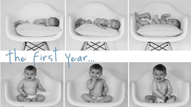
GALLERY: Baby's first year in photo's - month by month
- From day one to first birthday — at no other...
Fun in the Sun
- 7 fun and down-right clever ideas for hijinks...
Overcome worry & find joy
- Fear and worry can rob us of joy but the...
Playful Parent
- Life is busy and we all have stuff to do, so...
We help you find the time to exercise
- We’ve all heard the benefits of being active...
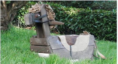
How to make a Rocking Horse
- The winner of our inaugural Upcycling...
Cheesy ketchup scones
- Roll up sleeves and don aprons for these...
lemon and white chocolate muffins
- Roll up sleeves and don aprons for these...
Triple chocolate cookies
- Roll up sleeves and don aprons for these...
A Gold Coast 'toddler-moon'
- Seeking some quality time before baby number...

